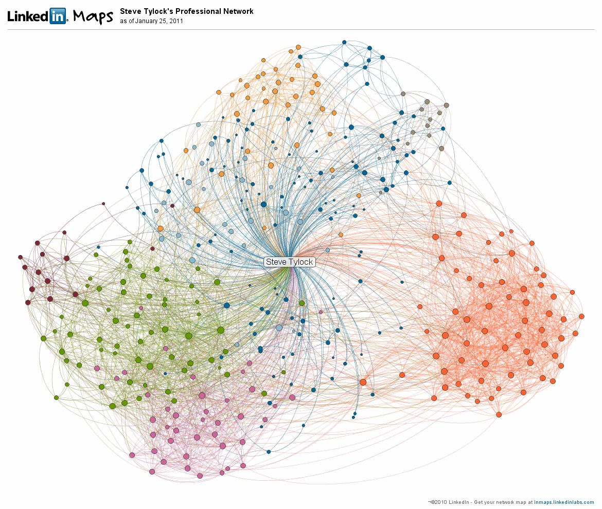
Big news out of LinkedIn this week – the InMap.
Ever want to get a handle on just who you connect to on LinkedIn? LinkedIn has released a new gadget that lets the users visualize connection patterns.
It’s way cool – so let’s have a look.
LinkedIn maps – inmaps
Let’s get you the ability to see this for yourself right off.
Click here to see your own inmap
[* Update – this is one area where “% completeness” matters – your profile must be 75% complete and you need at least 50 connections to use this widget! *]
When you get to this page, you first need to give permission for the inmap application to “see” your LinkedIn connection network – go ahead. (btw – this is the first clue that while officially supported by LinkedIn, this is treated as an external application – and that’s a good thing)
The software will now organize and display your connections in a multi-colored web of nodes and links.
Each of your connections will be categorized by some common-feature (and no, they don’t give you that algorithm), and when your connections reach each other, the display will show it.
Finding the common thread
The application doesn’t “know” how they connect – but you do.
So you’ll be presented with a color coded key and you get to decide why similarly colored profiles have been grouped together.
Perhaps you realize that everyone colored purple worked at ACME widgits – name them “ACME”. Go through the entire map and see what you find.
Only one color
And things might get interesting – say you know two groups of people – those from ACME and also those that you know through the Professional Azalea Society.
The inmap process has to put Violet McKenzie into one group or the other – and just like you, she belongs to both and knows people in both groups…
Rest assured that Violet will end up in one of the groups, and you have no control. Just remember that she straddles them, and LinkedIn “thought” she was more like one. (though it might be surprising to you which group it appears to the inmap application that she is “closest” to.
My inmap
I found it very interesting to look at my own inmap.
I’m not going to translate the key for you, but rest assured it accurately shows people that I’ve met through different sections of my career and personal life.
Some areas are distinct, others blend. Overall it is rather balanced.
When you hover over the nodes in your own map, it displays the names and headlines of the individuals.
Try it out – and take notice
Give it a try – see how your connections match up against your perception.
And once you get into it, you might discover new ways to help you connections, play matchmaker, or expand your connection network into areas that seem under-represented.
As always, to your continued success,
steve
—
Steven Tylock
http://www.linkedinpersonaltrainer.com
http://www.linkedin.com/in/stevetylock

2 Comments
Comments are closed.